If your visual storytelling requires you to project into the future, you can easily visualize one or more of your lines as dashed lines. And in true Line, bar, pie manner, this feature packs a punch of customization and styling options.
To get started,
- 1
-
Create a new visualization from the Line chart starting point.
- 2
-
Head over to the Lines, dots and areas settings.
- 3
-
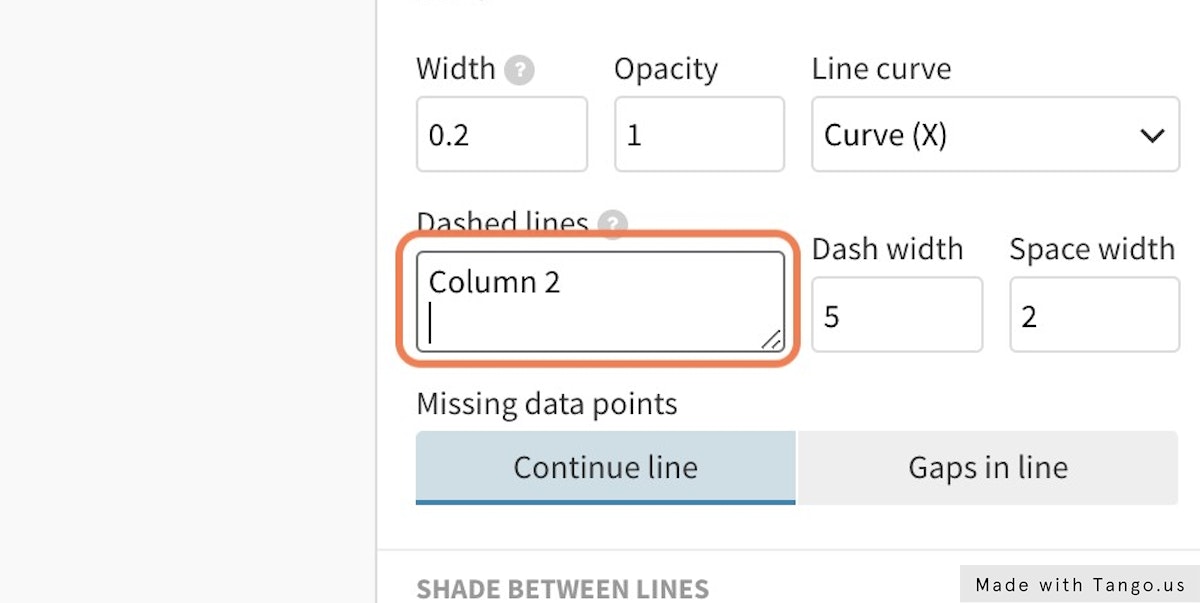
Supply the series you would like to make dashed in the Dashed lines text area.
-
TIP: We recommend copy-pasting your column headers from the datasheet to avoid small typos.
-
Use the Dash width and Space width settings to adjust the style of your dashed lines.